jeremy zucker concert posterJULY 2024
For my job at the Purdue Student Union Board, I was tasked with creating their concert poster for their 2024 Fall Concert. The artist chosen for this year was Jeremy Zucker.
THE PROCESS:
MOODBOARD GIVEN TO ME BY MY EMPLOYERS:
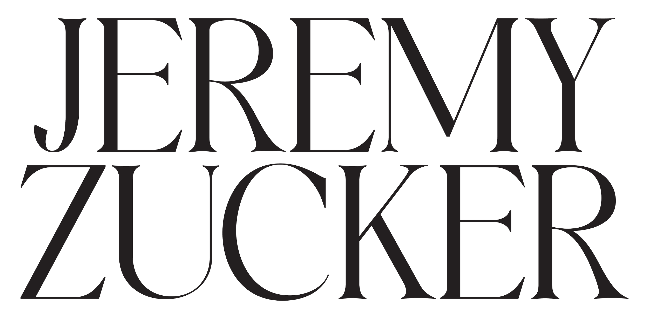
LOGO AND IMAGE GIVEN TO ME BY JEREMY’S TEAM:
One of the biggest challenges was working within strict limitations—I had only one photo and one logo to use. I began by playing around with the original picture, but after some experimentation, I realized that the picture would be more compelling if I added some adjustment layers in Photoshop. I took the original photo and added in clouds along with a halftone effect that was navy blue.
The aesthetic of the photo was now completely different, but also still aligned with Jeremy Zucker’s own personal aesthetic which was super important. I then chose a very modern looking font that I thought best balanced out the Serif typeface that his logo is in. I believe this project best showcases my typography skills and technical abilities, as the poster's simplicity required thoughtful design choices to make it visually compelling.
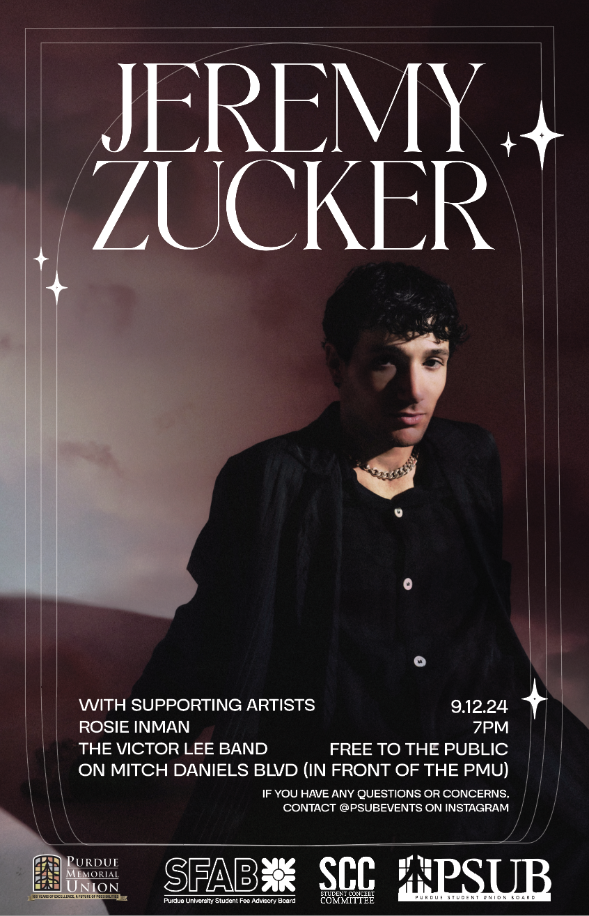
FINAL POSTER:
OTHER DELIVERABLES:
Along with the poster, I also had a few other deliverables I had to create for PSUB. This included another poster in the A-frame format, an instagram post, and a crescent banner.
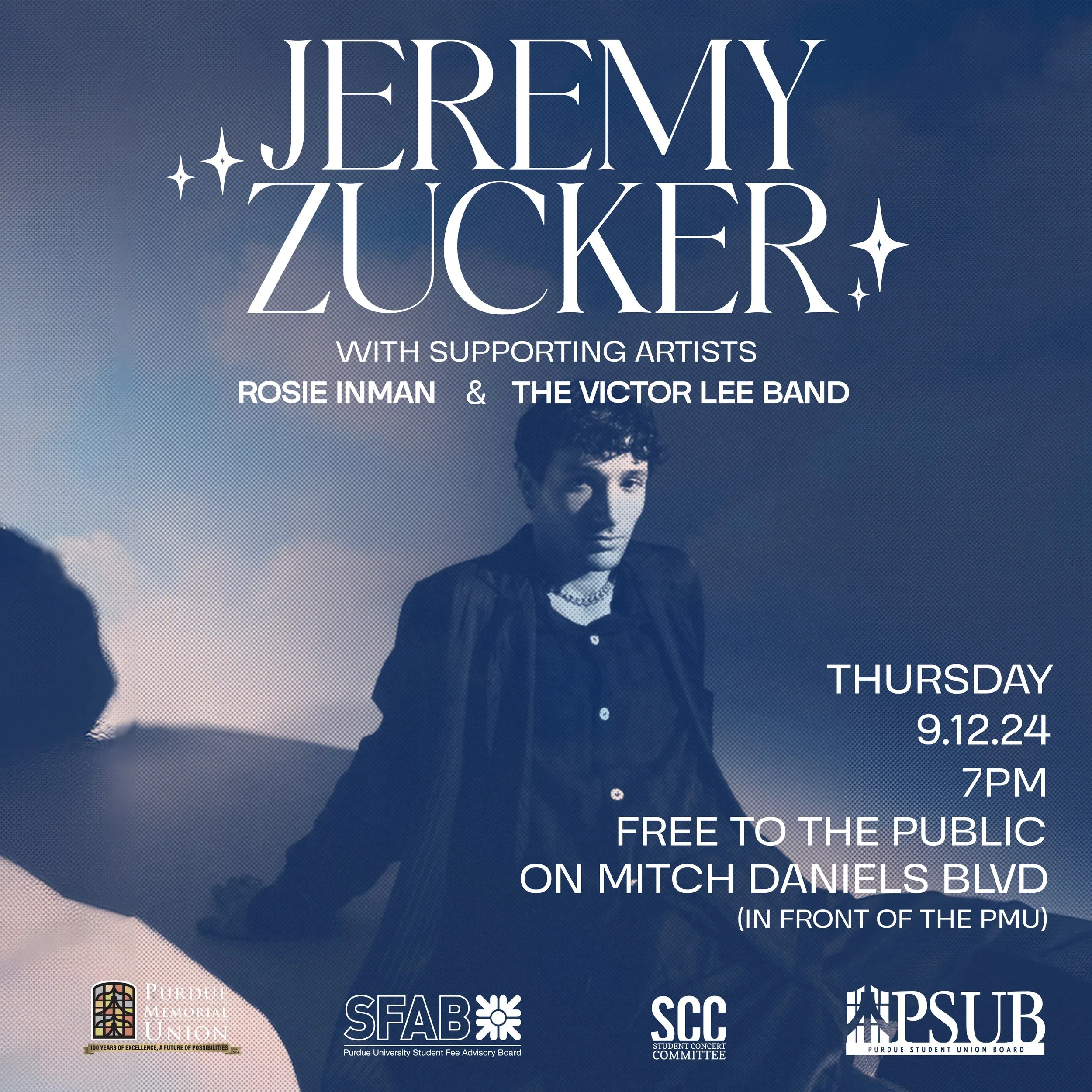
INSTAGRAM POST:
The instagram post was very important, considering this is how a lot of people on campus would be finding out about the fall concert. Because of that, I needed to make sure it stood out from the other PSUB social media posts, and was visually compelling enough for people to pay attention to it on their feed.
CRESCENT SIGN:
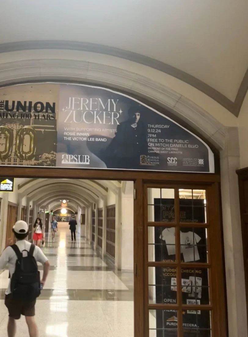
The crescent banner was by far the most difficult, considering its complicated shape that it has. I had to work to reformat the original design in order to meet these other deliverables, but I think they ended up working out well.
REAL WORLD APPLICATION:
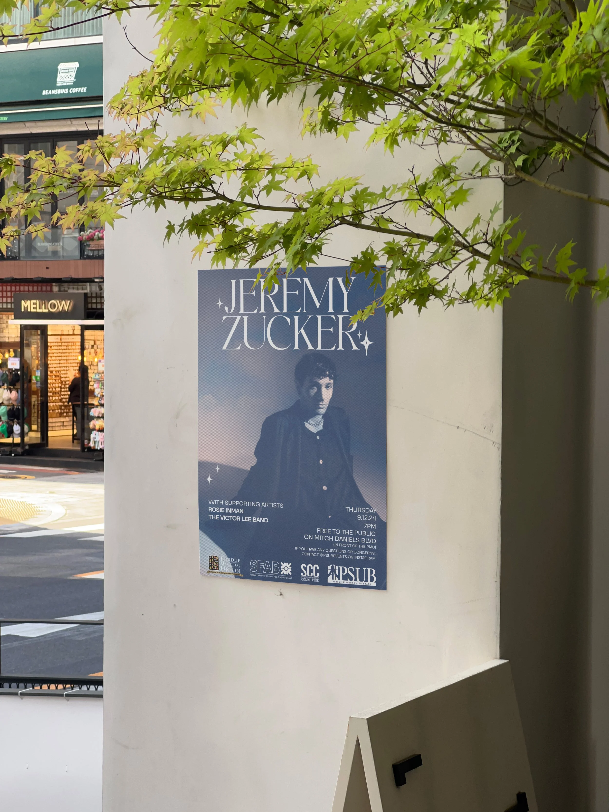
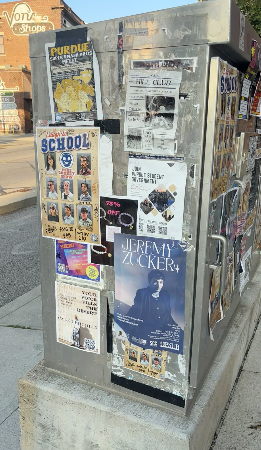
One of the coolest parts about this project was being able to see my design around the Purdue campus, as well as across other platforms. Walking around campus, there were numerous spots (both indoors and outdoors) that my poster was seen hanging. The week before the concert as well, the crescent sign was hung above a doorway in the Purdue Memorial Union, and the day of the concert the A-frame formatted poster was printed on signs to be displayed outside the union. The venue ended up being outside on one of the main streets of Purdue, so I think starry aspects of the poster really contributed to the overall atmosphere. Overall, I am very proud of this poster and it gave me some great experience to take with me into my professional career.


