Poshmark App Re-designSEPTEMBER 2024
For this project, we were assigned to choose an app that we wanted to re-design, so I chose Poshmark. My main goal was to make it easier to navigate, and to remove some of the unnecessary elements that it has currently.
THE PROCESS:
The app that I chose to re-design was Poshmark. Poshmark is an app where people can resell and buy used clothing, so essentially online thrifting. Personally, I try to shop more sustainably, so I used to use Poshmark quite frequently. That being said, I switched over to their competitor due to how difficult the app was to navigate. There are a ton of repetitive elements and elements of social media (lives, stories, etc) within the app that I find are unnecessary. Because of this, I thought that Poshmark would be the perfect app to re-design because it genuinely is an app I used to use a ton but no longer do just because of how difficult it is to use.
APP BEFORE:
HOME/FEED
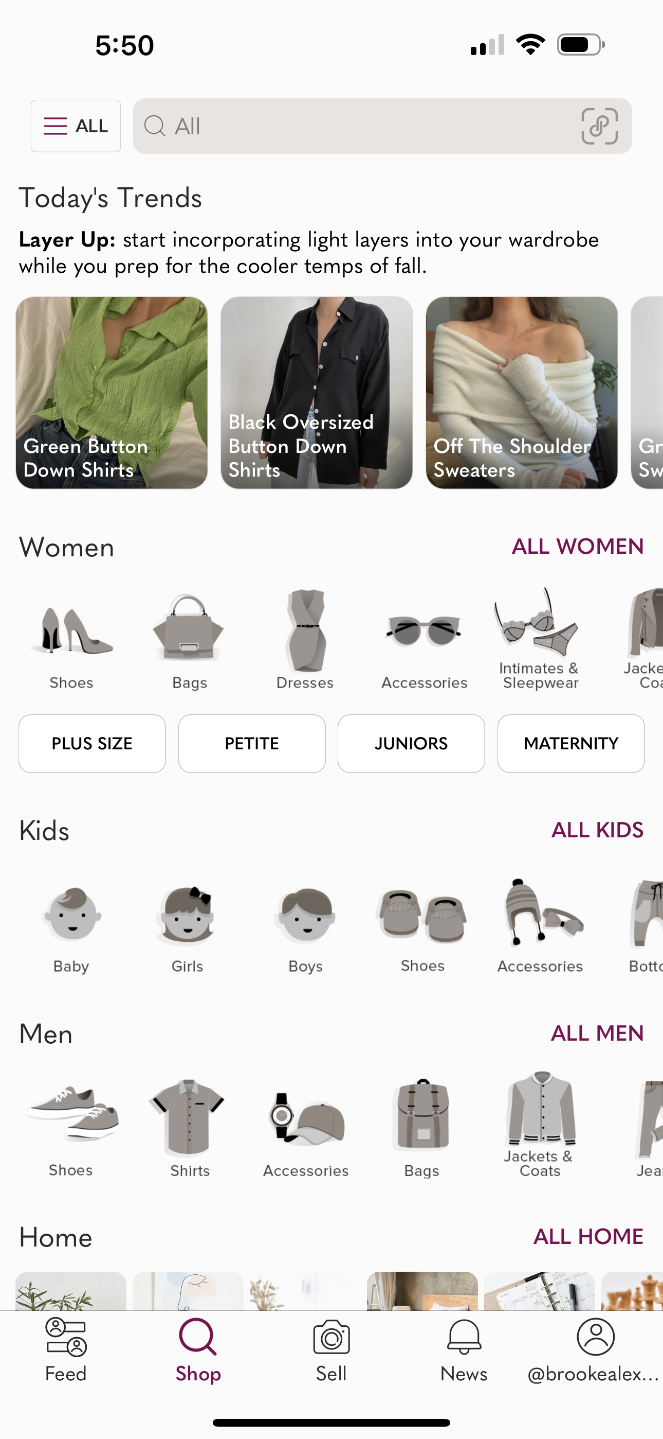
SHOP
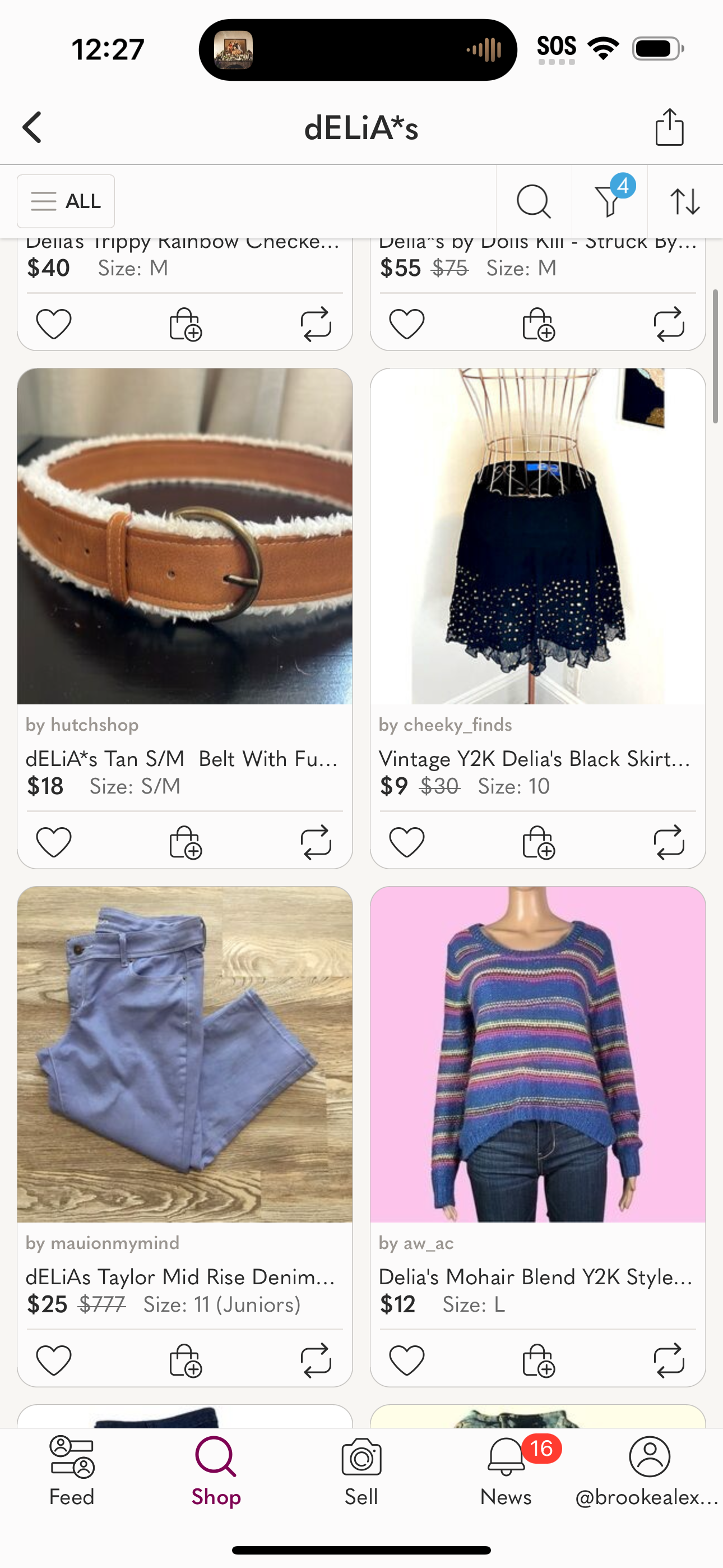
SHOP
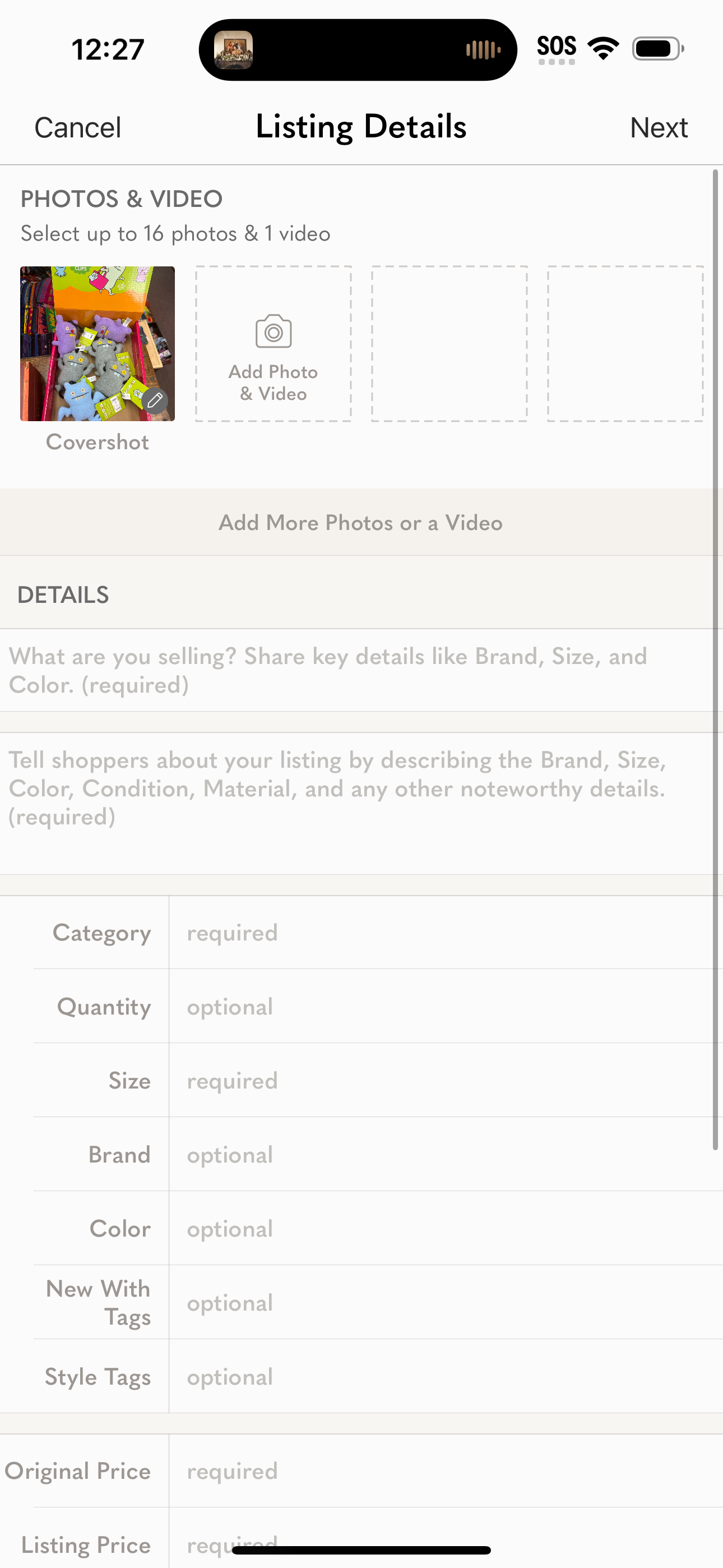
SELL
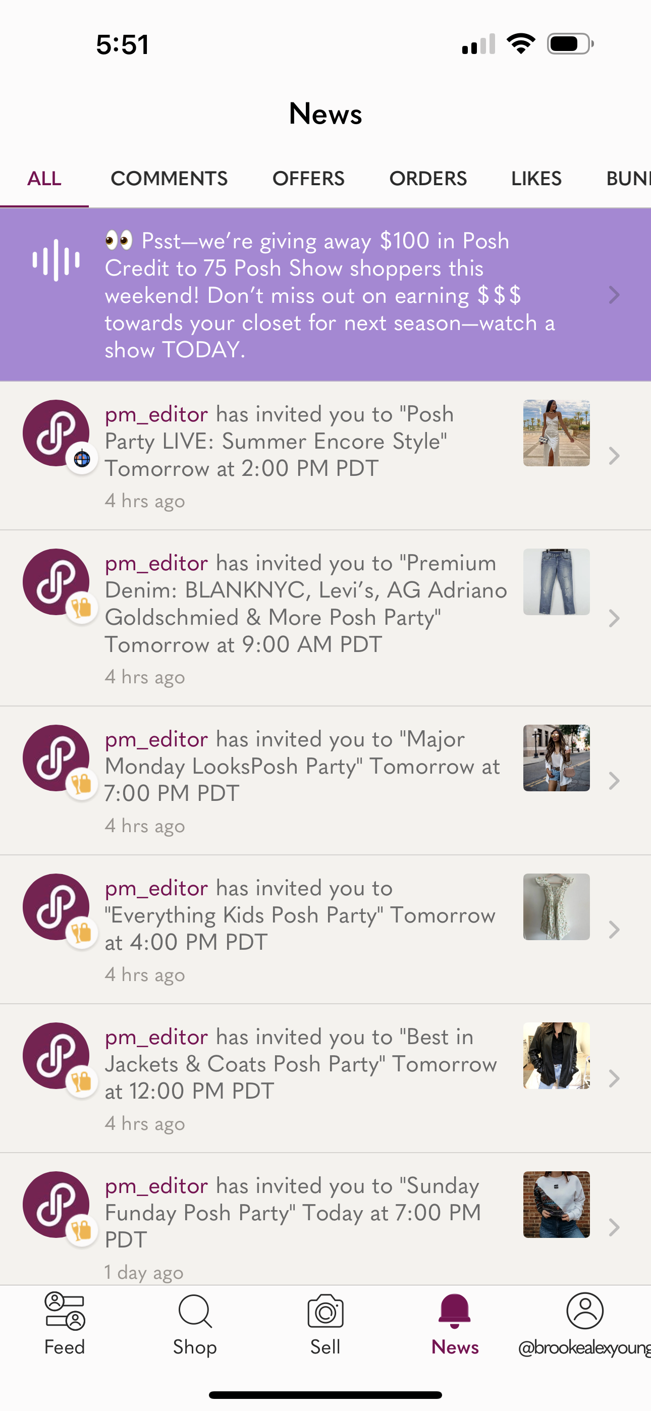
NEWS
PROFILE
As you can see in the screenshots, the original app is just very unorganized and repetitive, making it an overall difficult experience.
LOW-FIDELITY WIRE FRAMES:
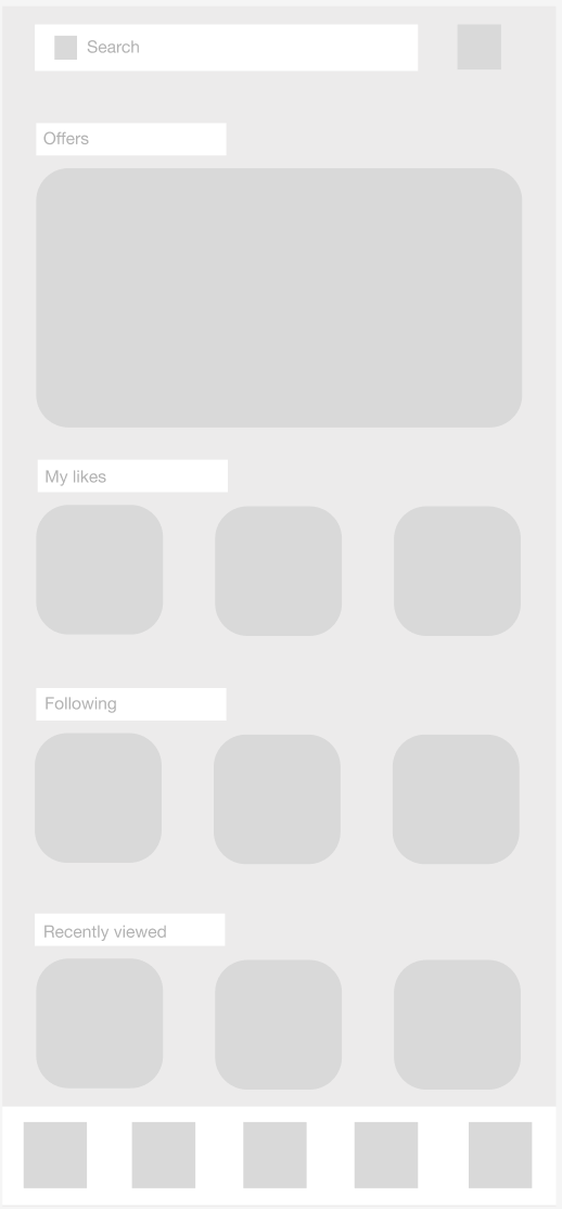
HOME/FEED
SHOP
SHOP
SELL
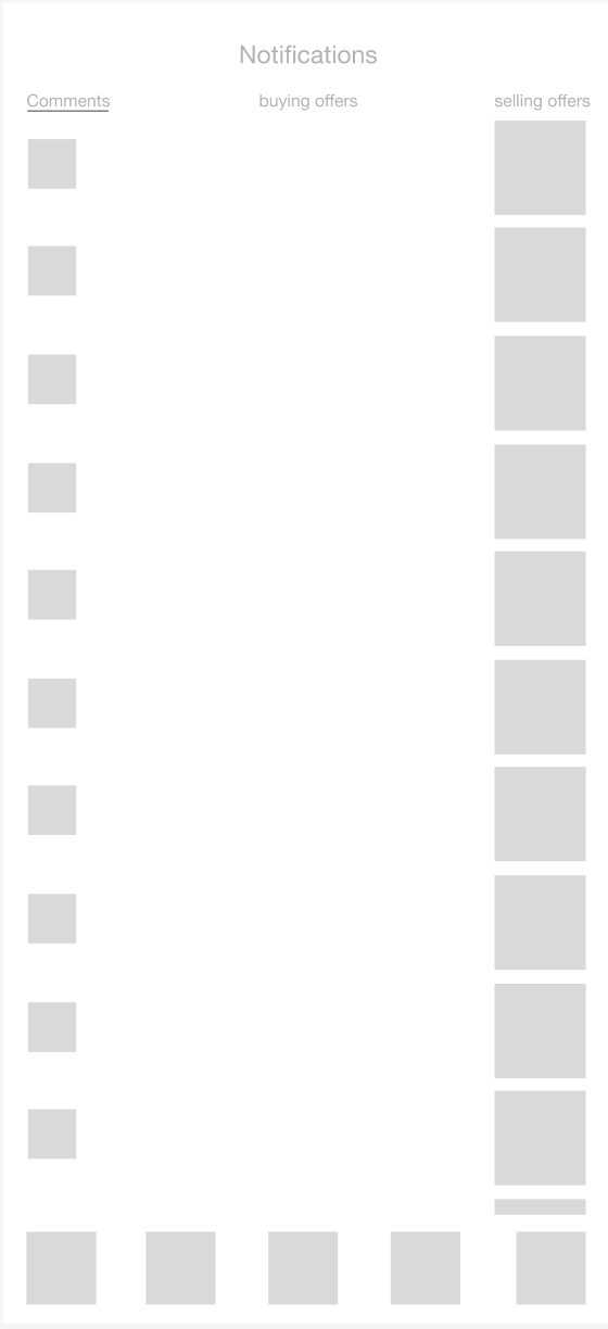
NEWS
PROFILE
I really tried to make these low-fidelity wireframes a lot simpler, making the entire app re-design app simpler.
STYLE GUIDE:
FINISHED RE-DESIGN:
Click below to view a walkthrough of the whole app re-design:


